
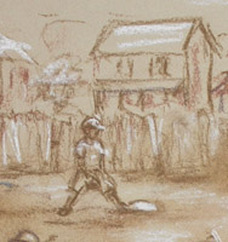
 Tip #4 Drawing the first sketch
I prefer to do the initial sketch in brown tones of either a pastel pencil or hard pastel ~ Using light ocher for highlights. My reason is that either a pencil or charcoal can show or bleed through the pastel. It can take a lot to cover that up. Not so with the browns. More on Underpainting and Thumbnail sketch -in another tip
0 Comments
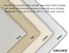 Tip #3 Choosing the right paper
The paper’s color and texture is suited to your personal tastes and techniques. Unless you are going for an overall color undertone, for example a blue snowy night, I like to stay with neutrals such as grey or tan. This aids in adding to the middle tones of your painting. I feel it is best to stay with an all rag, or mostly rag paper. The archival quality of this paper keeps the colors from changing or darkening over time. The tooth or the roughness of texture is another consideration. A rough tooth will take more pastel. I prefer a smoother texture such as a vellum, I love the way I can work in the details. My paper of choice is Rives BFK in tan. (See photo) |
AboutThis blog will offer regular (I hope) tips about pastels and pastel painting that I have found useful over the years. Just random thoughts and comments. Archives
January 2020
Categories
All
|
 RSS Feed
